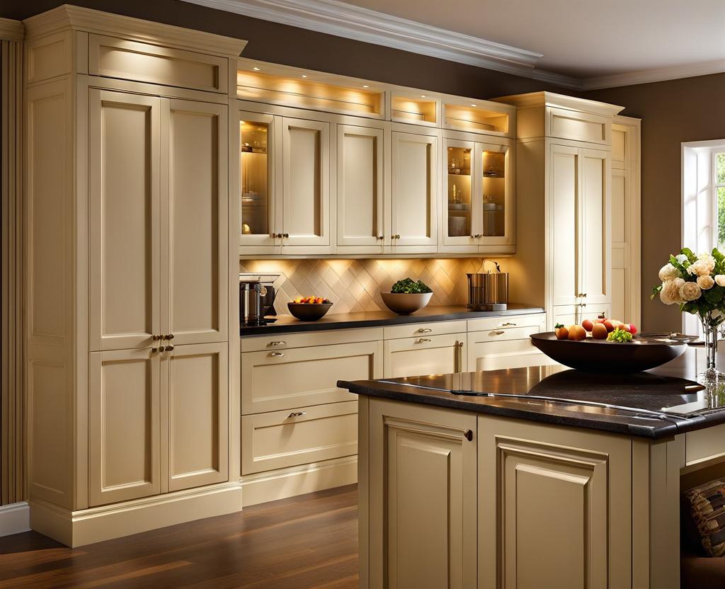
When it comes to creating a warm and inviting kitchen space, few elements can match the timeless elegance of cream kitchen cupboards. These soft, creamy hues exude a sense of sophistication and tranquility, making them a popular choice for homeowners seeking a calming yet chic ambiance. However, finding the perfect wall color to complement these beautiful cabinets can be a daunting task. That’s where this comprehensive guide comes in – allowing you to unlock the secrets of harmonious color combinations and elevate your kitchen’s aesthetic to new heights.
Understanding the Impact of Wall Colors on Cream Kitchen Cabinets
The wall color you choose for your kitchen plays a pivotal role in setting the overall tone and ambiance of the space. It’s not merely a matter of personal preference or adhering to the latest trends; the right wall hue can either enhance or detract from the beauty of your cream kitchen cabinets. To ensure a cohesive and visually appealing design, it’s crucial to consider factors such as lighting, kitchen size, and your personal style preferences.
One of the most significant aspects to consider is the psychology of colors and their influence on our emotions and perceptions. Certain shades can evoke feelings of warmth, energy, or serenity, while others may appear harsh or uninviting. By understanding the psychological impact of different hues, you can create a space that not only looks stunning but also fosters a desired emotional response.
For instance, warm colors like reds, oranges, and yellows are often associated with energy, enthusiasm, and appetite – making them ideal choices for creating a vibrant and lively cooking space. On the other hand, cool tones like blues and greens tend to have a calming and relaxing effect, perfect for creating a serene retreat within your home.
Additionally, it’s essential to consider the amount of natural light your kitchen receives. Bright, sun-drenched spaces can handle deeper, richer wall colors, while rooms with limited natural light may benefit from lighter, airier shades to prevent a closed-in or gloomy atmosphere.
Timeless Neutrals: Exploring Elegant Wall Color Palettes
When it comes to pairing cream kitchen cabinets with wall colors, neutrals are often a failsafe choice. These versatile hues offer a timeless and elegant backdrop, allowing the cabinets to take center stage while creating a harmonious and calming environment.
- Warm and Inviting Neutral Shades: Beige, taupe, and greige (a perfect blend of gray and beige) are excellent options for creating a cozy and welcoming atmosphere. These soft, earthy tones complement the warmth of cream cabinets and can make even the smallest kitchens feel inviting and comfortable.
- Cool and Calming Neutral Tones: For those seeking a more serene and tranquil vibe, shades like pale blue, soft white, or light gray can work wonders. These cool hues help balance the warmth of the cream cabinets, creating a fresh and airy ambiance that’s perfect for modern or coastal-inspired kitchens.
The beauty of neutral wall colors lies in their versatility – they can be easily paired with a wide range of accents, textures, and decor styles, allowing you to create a unique and personalized space that reflects your taste and personality. Additionally, neutral hues provide a timeless foundation that can easily be updated or refreshed with new accents and accessories as trends evolve.
For those seeking a more cohesive and seamless look, consider carrying the neutral wall color throughout the entire kitchen, including the adjoining living or dining areas. This approach creates a sense of flow and continuity, making the space feel more expansive and inviting.
Bold and Beautiful: Embracing Vibrant Wall Color Choices
While neutrals offer a safe and timeless option, don’t be afraid to embrace bolder and more vibrant wall color choices. Cream kitchen cabinets provide the perfect canvas for experimenting with rich and saturated hues, adding depth and personality to your culinary haven.
- Energizing and Uplifting Hues: Warm shades like yellow, orange, or red can infuse your kitchen with a burst of energy and vibrancy. These lively colors pair beautifully with cream cabinets, creating a cheerful and inviting atmosphere that’s perfect for entertaining or simply brightening up your daily routine.
- Soothing and Serene Shades: If you prefer a more relaxed and tranquil vibe, consider cool tones like blues, greens, or soft purples. These calming hues can help create a serene oasis within your home, providing a peaceful retreat from the stresses of daily life.
When incorporating bold wall colors, it’s essential to strike a balance and avoid overwhelming the space. One effective approach is to use the vibrant hue as an accent wall, drawing the eye and creating a focal point within the kitchen. Alternatively, you can incorporate these rich tones through accent pieces, such as artwork, rugs, or accessories, allowing you to enjoy the depth and richness of the colors without overpowering the overall design.
It’s also worth considering the size and layout of your kitchen when selecting bold wall colors. Smaller spaces may benefit from lighter, airier shades to create a sense of openness, while larger kitchens can handle deeper, more saturated hues without feeling cramped or overwhelming.
To truly achieve a cohesive and visually appealing kitchen design, it’s crucial to consider how your chosen wall color will harmonize with other elements in the space. From countertops and backsplashes to flooring and lighting fixtures, every component plays a role in creating a unified aesthetic.
Start by evaluating the existing materials and finishes in your kitchen, such as the countertop material, cabinet hardware, and flooring. Use these elements as a guide to select wall colors that will complement and enhance their natural tones and textures. For example, if you have warm, earthy-toned countertops, consider wall colors in the same warm color family, such as terracotta or sage green, to create a seamless and harmonious look.
If you have a busy or patterned backsplash, you may want to opt for a more subdued wall color to avoid overwhelming the space. Alternatively, you can embrace the boldness of the backsplash by selecting a complementary wall color that ties the entire design together in a cohesive and intentional manner.
Accessories and decor can also play a significant role in tying the entire design together. Incorporate accent colors through artwork, textiles, or decorative pieces to create a visually cohesive and seamless transition between the different elements of your kitchen. For instance, if you have a deep blue accent wall, consider incorporating hints of that same hue through a patterned area rug or colorful dishware displayed on open shelving.
When it comes to lighting, be mindful of how different wall colors can affect the overall ambiance of the space. Warm, rich tones can create a cozy and inviting atmosphere, while cooler shades may result in a more crisp and modern feel. Consider the type of lighting you have in your kitchen – natural, ambient, or task – and how it interacts with your chosen wall color to create the desired mood and atmosphere.
Remember, achieving a harmonious and visually appealing kitchen design is an art form – one that requires careful consideration and a keen eye for detail. By taking the time to coordinate your wall color choices with the other elements in the space, you can create a stunning and inviting kitchen that not only looks beautiful but also feels like a true reflection of your personal style.

This is where you’ll find inspiration to create a stylish and beautiful dream home.
