Ahh, the timeless beauty of cream cabinets – a dream for any home decorator. But the real challenge lies in finding that perfect wall color to make those cabinets truly shine. Fear not, my friends, for I’m here to guide you through the maze of hues and shades to achieve that perfect wall color for cream cabinets.
Unveiling the Perfect Wall Color Harmony for Cream Cabinets
When it comes to selecting the ideal wall color for cream cabinets, the key lies in striking the right balance. Cream, being a warm and versatile neutral, can work beautifully with a range of colors – from soft pastels to bold, vibrant hues. But the trick is to choose a color that complements the cabinets without overpowering them or creating a jarring contrast.
One fail-safe approach is to opt for warmer shades that harmonize seamlessly with the creamy tones of the cabinets. Think earthy hues like terracotta, sienna, or ochre, which can lend a cozy, inviting ambiance to your kitchen or living space. Alternatively, you could go for a classic pairing with shades of gray – from soft, misty grays to deeper charcoal tones – for a more modern and sophisticated vibe.
But hold up, let’s not forget the power of contrast! Pairing cream cabinets with a darker, moody wall color like deep navy or forest green can create a bold, dramatic statement that oozes sophistication and depth. Just be sure to balance it out with plenty of natural light and lighter accents to prevent the space from feeling too enclosed or overwhelming.
Wall Color Psychology: Setting the Right Mood
But wait, there’s more to wall colors than just aesthetics! The hues you choose can significantly influence the overall mood and energy of a space. And let’s be real, who doesn’t want their home to be a sanctuary of positive vibes?
- Warm tones like red, orange, and yellow are known to stimulate energy and promote a sense of warmth and coziness.
- Cool hues like blue and green are often associated with calm and tranquility, making them excellent choices for creating a serene and relaxing atmosphere.
- Earthy tones, like sage or olive green, can evoke a sense of harmony and connection with nature, perfect for those seeking a grounding and rejuvenating space.
So, when selecting your wall color, consider not just the visual appeal but also the emotional impact you want to create in your living spaces. For example, if you’re aiming for a cozy, welcoming kitchen, warmer tones like terra cotta or golden yellow might be the way to go. But if you envision your living room as a tranquil retreat, cool, soothing shades of blue or green could be the perfect match for your cream cabinets.
Exploring Complementary Wall Color Palettes
Now, let’s dive into the world of color theory and explore some harmonious palettes that can work wonders with cream cabinets. One classic approach is to pair cream with its complementary color on the color wheel – a muted shade of blue or green. This creates a visually striking contrast while maintaining a sense of balance and cohesion.
For a more daring and vibrant look, you could experiment with analogous color schemes, which involve hues that are adjacent on the color wheel. For instance, a warm terracotta wall paired with cream cabinets and accents of rich oranges and yellows can create a stunning, Mediterranean-inspired aesthetic.
But why stop there? Consider incorporating triadic or split-complementary color schemes for a truly dynamic and eye-catching palette. A triadic color scheme combines three colors that are evenly spaced on the color wheel, like cream, deep plum, and sage green. Meanwhile, a split-complementary scheme combines a base color (like cream) with two colors adjacent to its complement, such as cream, muted blue, and warm yellow. These more complex color combinations can add depth, interest, and a touch of sophistication to your space.
Cream Cabinet Color Companions: Crisp, Warm, and Bold Hues
Let’s take a closer look at some specific wall color options that can beautifully complement your cream cabinets:
- Crisp Whites: A classic choice that never goes out of style. Pair cream cabinets with a bright, clean white wall for a fresh, airy, and timeless look.
- Warm Neutrals: Soft, earthy tones like beige, khaki, or greige (a blend of gray and beige) can create a cozy, inviting atmosphere while allowing the cream cabinets to take center stage.
- Bold Jewel Tones: For those seeking a more dramatic and luxurious vibe, consider rich, saturated hues like emerald green, sapphire blue, or amethyst purple. When paired with cream cabinets, these bold colors can create a stunning, luxe aesthetic.
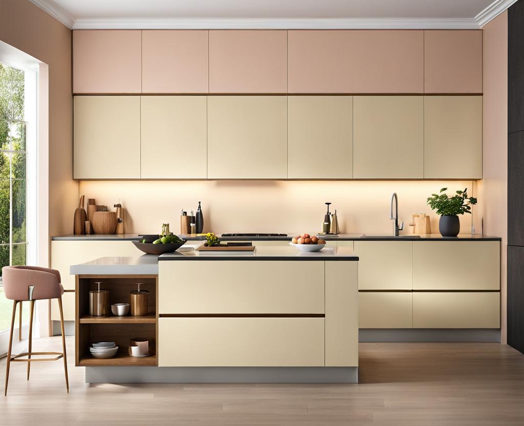
- Soft Pastels: If you’re aiming for a more delicate and romantic vibe, pastel shades like blush pink, baby blue, or mint green can provide a gentle, soothing contrast to the creamy warmth of your cabinets.
- Warm Metallics: Metallic accents like brushed gold or burnished copper can add a touch of glamour and sophistication when paired with cream cabinets. Consider using these tones as accent walls or in small doses throughout your design.
Now that we’ve explored the world of wall colors, let’s talk about some pro tips to ensure your cream cabinets truly shine:
- Pay attention to lighting: The way light interacts with your wall color can significantly impact the overall look and feel of your space. Consider natural light sources and artificial lighting when making your color selections.
- Play with textures: Introducing different textures, like a distressed or glazed finish on your cabinets or wallpaper on your walls, can add depth and visual interest to your space.
- Accessorize wisely: The right accents and decor pieces can tie the whole look together. Think about incorporating complementary colors through artwork, rugs, or even small appliances to create a cohesive and visually appealing design.
- Consider the flow: If your cream cabinets are part of an open-concept space, make sure to consider the flow and continuity of colors between different rooms. You may want to carry the wall color from one space to the next or introduce complementary hues to create a seamless transition.
- Don’t forget the ceiling: While walls are the main focus, don’t overlook the impact of your ceiling color. A crisp white ceiling can make a space feel brighter and more open, while a colored ceiling can add depth and drama to a room.
Remember, the key to a successful design lies in finding the perfect balance between the wall color, cabinet color, and overall aesthetic you’re aiming for. Don’t be afraid to experiment and have fun with different color combinations until you find your perfect match. And most importantly, trust your instincts – after all, your home should be a reflection of your unique style and personality.

This is where you’ll find inspiration to create a stylish and beautiful dream home.